Designing the logo for Harvard University Employees Credit Union
I worked with Harvard University to redesign the visual identity of its bank – HUECU. The team at HUECU were already in the middle of a rebranding exercise when they reached out to me. They felt it was important to explore the possibilities of working with someone who had an outside perspective and zero personal connection to the brand.
After the team had seen 60+ new logo design concepts from other designers and agencies, it made sense to me, not to move far away from what already successfully represented them. Instead, we just needed to reimagine it.
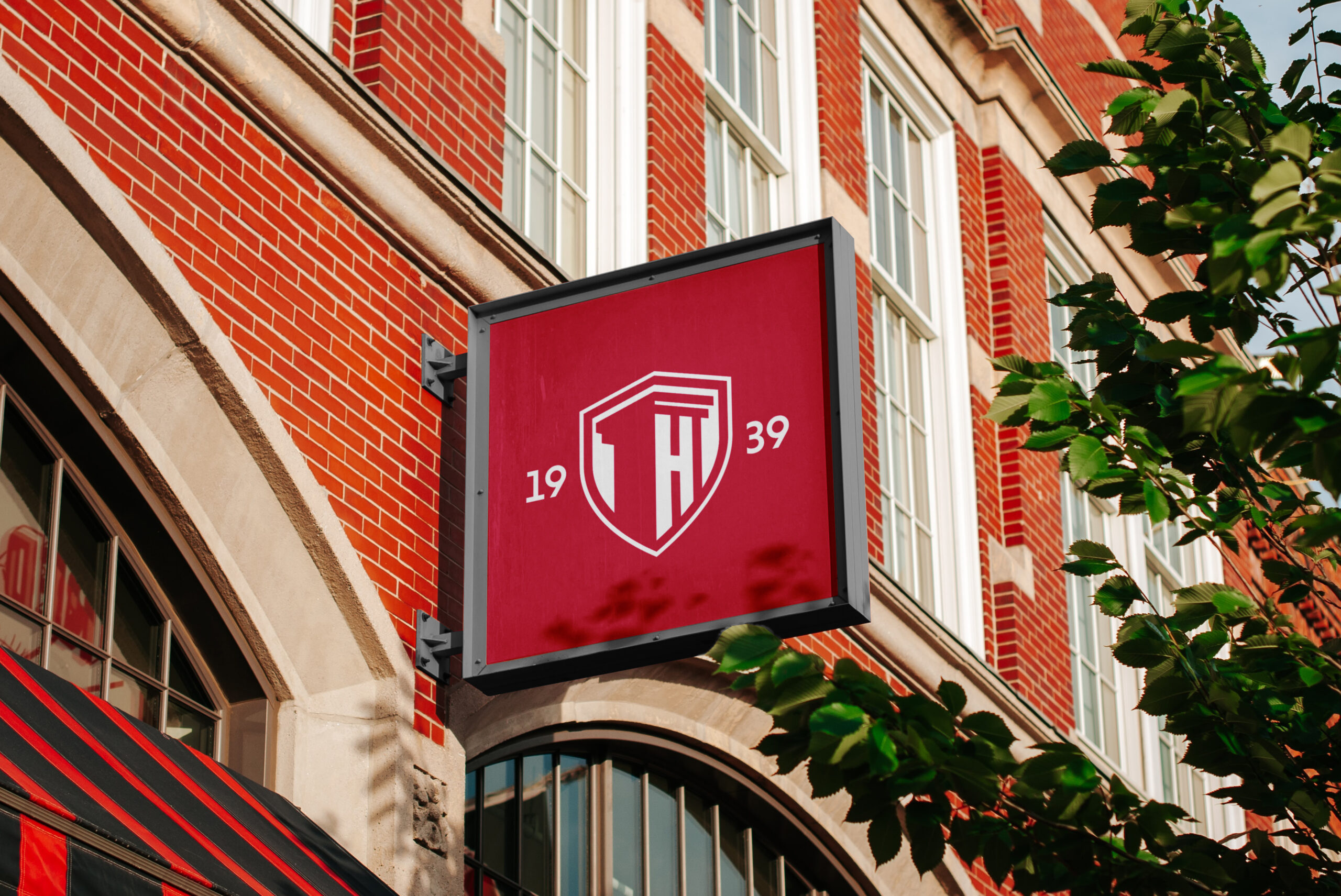
Built from the traditional Harvard University Shield
It was important for HFCU to become its own stand-alone identity but respect its roots in the 387-year-old institution. With this in mind, I drew inspiration from Harvard University’s original shield logo and looked at it from a different perspective. As we look at the column symbol in the logo, it felt appropriate to look up at the shield from the same perspective. This gave us a new shield that HFCU could own without leaning on Harvard University’s identity anymore.